When I bought my new house in early September, I vowed that the first thing I would do would be to repaint the inside. The builder had covered the walls in a warm, creamy white -- and if there's one thing I hate, it's warm, creamy white walls, because as far as I'm concerned, that's just code for "yellow."
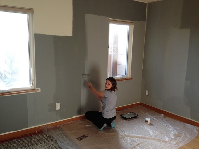
My original plan had been to paint the walls within a week or two after closing, buy all my furniture, and be moved in and settled by the end of October. Now I chuckle at the optimism of a baby homeowner! Here we are, three months later, and painting has only just now begun. Painter Chris arrived this morning. I gave him a tour, a set of keys, and a list of colors with instructions. He's upstairs right now taping the master bedroom. If all goes well, the work should be done by mid-December.
The initial reason for the three-month delay was Chris's schedule. Turns out good painters in Seattle tend to be booked several months out. This was the earliest he could do the job.
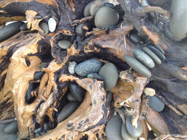
But it turns out three months was only just barely enough time to finalize my paint selection! Picking the right colors, it turned out, was no simple task. I started out with what I though was a good idea: Instead of the boring, all-white world of the prior owner, I wanted an elegant, understated palette inspired by the beautiful colors I had seen while hiking along the rocky beaches of the Puget Sound -- lots of blues and greys and greens, as well as rich woody tones and even a little red.
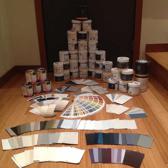
As luck would have it, I live only a couple of blocks from a paint store that sells C2 paint, which has long been my favorite. They specialize in colors that are tinted with colored pigments instead of the grays and blacks that many other brands use to darken their colors. The result is a rich, complicated color that shifts with the light and is hard to pin down. I stopped by and started building my color wheel.
My original plan had been to paint the walls within a week or two after closing, buy all my furniture, and be moved in and settled by the end of October. Now I chuckle at the optimism of a baby homeowner! Here we are, three months later, and painting has only just now begun. Painter Chris arrived this morning. I gave him a tour, a set of keys, and a list of colors with instructions. He's upstairs right now taping the master bedroom. If all goes well, the work should be done by mid-December.
The initial reason for the three-month delay was Chris's schedule. Turns out good painters in Seattle tend to be booked several months out. This was the earliest he could do the job.
But it turns out three months was only just barely enough time to finalize my paint selection! Picking the right colors, it turned out, was no simple task. I started out with what I though was a good idea: Instead of the boring, all-white world of the prior owner, I wanted an elegant, understated palette inspired by the beautiful colors I had seen while hiking along the rocky beaches of the Puget Sound -- lots of blues and greys and greens, as well as rich woody tones and even a little red.
As luck would have it, I live only a couple of blocks from a paint store that sells C2 paint, which has long been my favorite. They specialize in colors that are tinted with colored pigments instead of the grays and blacks that many other brands use to darken their colors. The result is a rich, complicated color that shifts with the light and is hard to pin down. I stopped by and started building my color wheel.
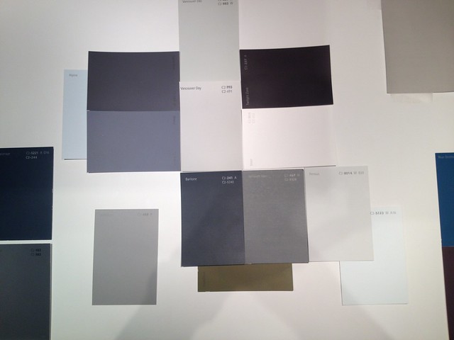
Once I'd gathered all my favorite paint chips, I started putting them up on the wall -- only to discover (yet again) that what looks good on the paint chip may not be what looks good on the wall. I put up color after color -- but none of them seemed quite right.
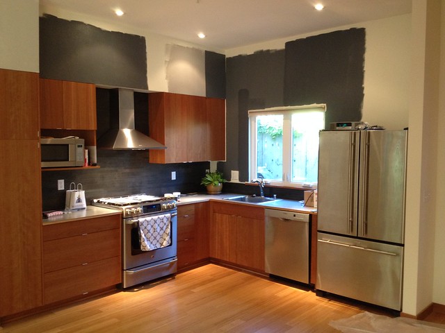 |
| The grays over the kitchen turned out blue (though of course they look perfectly gray here). |
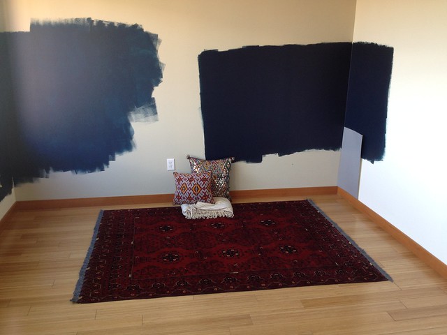 |
| I tried to match the navy blue in my rug, but instead got a couple of gorgeous dark teals. The colors almost won me over, but then I had trouble finding a complement for the master closet and bath. And once the rainy season hit, I realized that I wanted a lighter color for the bedroom. |
 |
| At first I wanted to carry the dark color from the kitchen up the stairs. But then I saw how dark it would be and opted for a lighter tone that would brighten the stairs and allow the great lines of the railing to stand out. |
 |
| The most vexing problem of all was finding a decent neutral for the living room. I wanted a color that lived in the elusive twilight between gray and brown. Everything I tried was disappointing -- too green or blue or pink or gold. Eventually even the guy at the paint store had had enough. He told me to go back to the first color I'd selected and try it again. Turns out I'd been right the first time -- that color was exactly what I wanted, only the person who had mixed the first sample had gotten the formula slightly wrong, so it turned out too blue. Costly mistake! |
 |
| The very last room to land was the guest bedroom. I knew I wanted Portland, but I couldn't decide between the full color (which transformed an otherwise drab Moroccan rug into something striking) or 50 percent (which would be less dark). Last weekend when Heather was here, we rolled out one last pint at 50 percent and decided that was the winner. |
In the end, I'd amassed an astonishing collection of paint chips (including a full C2 fan deck) and had tried out more than 30 sample pints of paint on the walls.
So where did I land? Well, perhaps not surprisingly given my starting inspiration, the Pacific Northwest is well represented: Most of the walls will be Vancouver Day, all ceilings will be Whistler White, and the guest bedroom will be Portland. As for the rest, they continue the variation on a theme of gray: Vault over the kitchen counters, Cronkite in the master bedroom, and Seraph in the master bathroom. The one real departure is the guest bathroom, which will be a deep reddish purple color called Twilight Zone (the only color I put up and instantly knew it was a winner).
Like I said, painting started today and will continue for probably about a month. I'm super excited to see it all come together, and to finally be able to focus on furniture! I'll post more photos as things progress.
3 comments:
Can't wait to see it!
How'd the Twilight Zone come out? I found this post by Googling the color name because there is an entire house in Ravenna painted that color and I am OBSESSED with it. But intrigued for interior as well...
Paige, the Twilight Zone is awesome! I used it for the guest bathroom and it's one of my favorite colors in the house. I can't figure out how to put a photo in a comment, but I'll see if I can get some photos up on the blog soon so that you can see it. I've been meaning to do that for a while...
Post a Comment