The first project for the semester in my interior design class is to create a full set of design materials for a bathroom. This entails a floorplan, elevations of the four walls, and selecting all of the hardware, finishes and accessories that would go into the room -- everything that you'd need to give to a contractor to implement the design. Once those things are done, then we're supposed to create a design board (think Pinterest, only with real materials glued to a foam core poster-sized foam core board) and a half-inch scale model of the bathroom for presentation to the client
Sounds super fun, right? A little artsy, a little crafty; a great excuse to flip through magazines and browse furniture and hardware stores. The problem, of course, is that to do it all properly, you have to devote some time -- which is precisely what I haven't had lately. For the past several weeks, my day job (where I've been billing about 70 hours a week) plus a few ambitious weekend commitments (such as riding 100 miles last weekend and an overnight jaunt to New York for the opera this weekend) has kept me working around the clock with little time to eat and sleep, let alone design a bathroom.
And so the unthinkable is about to happen: Next week, when our design projects are due and we're supposed to present them to the class, I will not be anywhere close to being done. (gasp!)
BUT, that doesn't mean I don't know what I would do if I had the time! In fact, I've imagined an awesome bathroom for Amanda. Keep in mind that it's a tad fictional, given that I'm working with room dimensions set by the curriculum and not Amanda's real bathroom; also, I haven't taken budget into account -- though I promise it's all totally worth it.
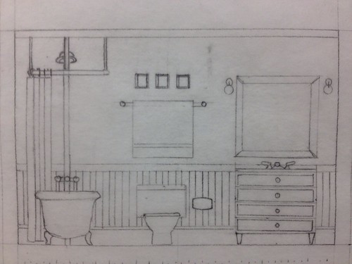
My only quasi-complete elevation starts to give a sense of what the room would look like:
Sounds super fun, right? A little artsy, a little crafty; a great excuse to flip through magazines and browse furniture and hardware stores. The problem, of course, is that to do it all properly, you have to devote some time -- which is precisely what I haven't had lately. For the past several weeks, my day job (where I've been billing about 70 hours a week) plus a few ambitious weekend commitments (such as riding 100 miles last weekend and an overnight jaunt to New York for the opera this weekend) has kept me working around the clock with little time to eat and sleep, let alone design a bathroom.
And so the unthinkable is about to happen: Next week, when our design projects are due and we're supposed to present them to the class, I will not be anywhere close to being done. (gasp!)
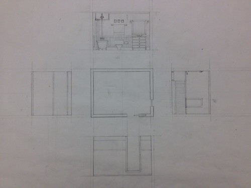 |
| My incomplete floorplan and elevations. This is why I'm only auditing the class and not taking it for credit. |
My only quasi-complete elevation starts to give a sense of what the room would look like:
Before I jump into the details of the design, here are some of the considerations that guided my choices: Anyone who knows Amanda will know that she's drawn to the colors blue and green. She loves texture and pattern, especially those that remind her of her world travels. She enjoys luxury but isn't fussy or formal. She likes the notion of a 19th-century cabinet of curiosities but also appreciates clean, modern lines. Her heritage is French, she lives in Colorado, and she has a slate-colored cat with an obscene amount of fur. She's feminine (though not girly) and isn't afraid of the unusual.
And so . . . the floor would be natural slate tiles . . .
 |
| Slate tile from Home Depot |
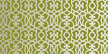 |
| Chez Sheikh stencil from Royal Design (in fact, this may be the stencil she has already used in other rooms) |
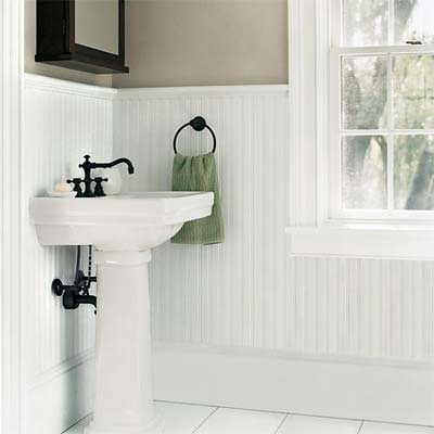 |
| Beadboard would be cool and would add nice vertical lines, but other types of paneling would work as well. |
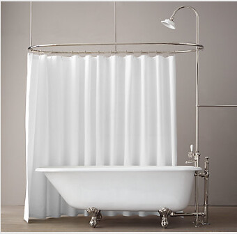 |
| Restoration Hardware Victorian bathtub with shower extension |
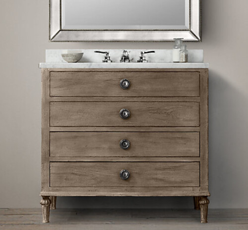 |
| Vanity from Restoration Hardware's "Maison" collection |
This is the best light fixture I found in the 10 minutes I devoted to looking. I'd say the jury is still out on this particular model, but at least you get the idea -- there would be one sconce on each side of the mirror above the vanity.
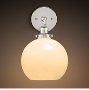 |
| A sconce, also from Restoration Hardware |
Ditto for the toilet. Something traditional with good lines. While I was hunting for bathtubs I found what must have been the holy grail of toilets because it was perfect and now I can't find it again for the life of me. (Unlike the actual holy grail, though, I'm not sure it's worth embarking on a quest to find it.)
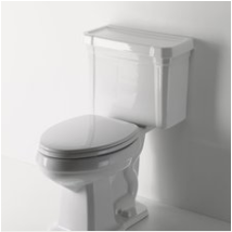 |
| This one is from Waterworks |
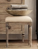
There should be a bench along the wall opposite the toilet/vanity, and it should look like this, only longer -- and with green velvet upholstery to match the walls.
Now back to the floor: Slate, by itself, will be cold, so on top of the stone tiles, a jute area rug. Preferably one with a strong pattern, like this one.
But jute, too, is kind of rough, so a smaller sheepskin rug would lie on top of the jute rug, in front of the vanity. So comfy! (And I really just love the idea of a floor layered with slate, jute and sheepskin -- the colors and textures would be wonderful.)
As for the walls, there's already a lot going on with the Moroccan stencil. BUT, to get that cabinet of curiosities feel, let's add some curiosities:
I think the only other primary feature that hasn't been discussed would be the door. Right now it's a regular swinging door -- I would propose converting it to a pocket door so that Amanda doesn't lose the floor space to the swinging door (that, at least, is shown in the floorplan above).
And there you have it. I haven't included photos of the towels (they'd be plain white) or other hardware/accessories (like towelrods and wastebaskets and whatnot), but I think those are pretty straightforward and would be selected in keeping with the same aesthetic approach as the other elements.
What do you think?
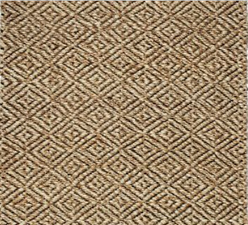 |
| Adamas jute rug from West Elm |
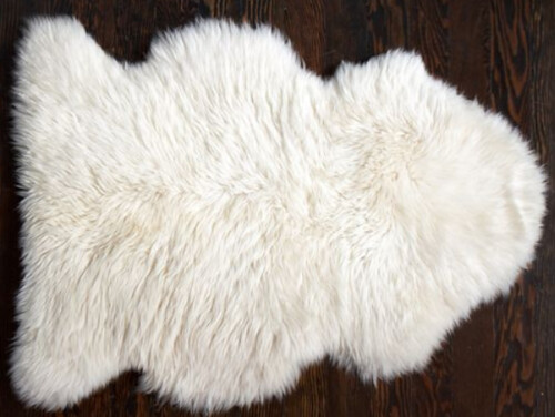 |
| Sheepskin rug from Pottery Barn |
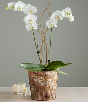 |
| You can order this orchid from Pro Flowers |
I think the only other primary feature that hasn't been discussed would be the door. Right now it's a regular swinging door -- I would propose converting it to a pocket door so that Amanda doesn't lose the floor space to the swinging door (that, at least, is shown in the floorplan above).
And there you have it. I haven't included photos of the towels (they'd be plain white) or other hardware/accessories (like towelrods and wastebaskets and whatnot), but I think those are pretty straightforward and would be selected in keeping with the same aesthetic approach as the other elements.
What do you think?


3 comments:
Yeah, I love pretty much everything you've described.
The stencil is indeed the one I have already, and imagining it in green with the white wood paneling underneath and the blue butterflies makes me swoon. The slate is awesome, the toilet is almost exactly the one I picked out in the Great Installation of last year, and the tub makes me want to finally hunt down the perfect gothic nightgown (although, I really should be bathing by candlelight if that's going to be the case).
I actually do have a window in that bathroom, pretty much exactly in the spot you drew it (drafted it?). It's almost always obscured by the door. I like the idea of a pocket door as a solution.
I have that print hanging in my classroom next to the spare pencils box, by the way. I like watching my students reach for a pencil, then freeze, transfixed and often horrified by the image. It amuses me.
Well done on your first one, especially with the time constraints you face. I'm looking forward to whatever's next!
Very nice ideas. Go to Pottery Barn Bath Lighting for some better options. And the additional soft, fluffy, snowy white towels are located where, in what? I like the handcarved wooden bowl/tray idea in the pic you included. Perhaps a woven grass or jute basket for more texture. Are there any exatic blue blooms for the window sill? Nothing overpowering, just something to echo the blue of the butterflies? Lady
Thanks for the ideas and suggestions, Lady! The baskets would be a great additional source of texture and shape in the bathroom (and also perform a useful container function). Given how uncommon blue flowers are, another idea might be to use a blue fabric for the window shad (I think a blue and white toile de jouy or floral motif might be interesting). And, yes, I do think that every bathroom should have a pocket watch clock!
Post a Comment